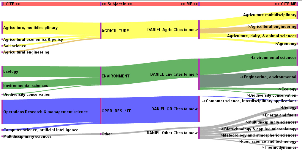
#Citations I’ve made are on the left. The citations I’ve made are grouped into subjects. Engineering is in a darker shade. Citations to me are on the right. This shows how I transform science into science of use by stakeholders of agri-environmental systems
This shows very clearly how I am an applied Operational Researcher. I draw in the science of my three degrees (#Agriculture, Applied Environmental Science) and produce science of use the the engineer, mangers, scientists and policy makers in the agri-environmental sectors. I get nearly no citations from #operational research and #Management Science Journals.
I’ve used Google Developers tools to produce this and they are far better than anything that Excel can do, but it is still a lot of informations to convey. It is hard to control all the features, but it is easier than a bespoke hand drawn visual.
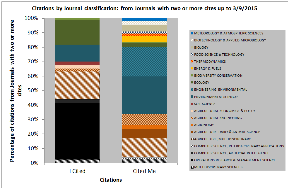
It is an alternative to the column chart, but is it any clearer?
Comparing the science I consume with the place my science gets consumed showing a clear difference in subject categories with less Operational Research and more Engineering, Technology and Multi-disciplinarity.
#A Sankey diagram would be a very good way of mapping the connections between the types of science journals I cite from and the types of science journal where I get cited. It may make this diagram clearer
Comparing the science I consume with the place my science gets consumed showing a clear difference in subject categories with less #Operational Research and more Engineering, Technology and Multi-disciplinarity.
The hard part of Sankey diagrams is doing them as Excel is little use., but I have found one method on Google Developer… and a useful blog site
For the curious, they’re named after Captain Sankey, who created a diagram of steam engine efficiency that used arrows having widths proportional to heat loss.
A sankey diagram is a #visualization used to depict a flow from one set of values to another. The things being connected are called nodes and the connections are called links. Sankeys are best used when you want to show a many-to-many mapping between two domains (e.g., universities and majors) or multiple paths through a set of stages (for instance, Google Analytics uses sankeys to show how traffic flows from pages to other pages on your web site).
To my opinion, Sankey diagrams are underestimated, and should merit a greater attention. Sometimes they are a better choice than a pie or bar chart to visualize information.
Hi, my name is Phineas. With this blog I would like to share with you my fascination for Sankey diagrams. My goal is to present to you Sankey diagrams I find on the net, and discuss them. I am mainly focusing on the graphical aspect, layout, methodological issues or shortcomings of diagrams. I do not intend to discuss the scientific content or the data behind them. Neither the politics.
Do you have a Sankey diagram you wish to share? Have you seen an interesting Sankey diagram that should be presented here? Or do you have a great idea what Sankey diagrams can be used for?
Acknowledgement: The guys at ifu (e!Sankey) kindly ceded this domain to me. I asked them politely, if I can use it for a blog on Sankey diagrams, and they said ‘yes’. They reserve the right to put up a banner here, but so far this hasn’t happened.
I am using Sankey Helper 2.1, STAN 1.1 and e!Sankey 3.0pro for drawing my Sankey diagrams. I have used test or demo versions of most of the Sankey diagram software tools available, like S.DRAW, or Sankey 3.1. Although I do find some tools better than others, I don’t intend to endorse any of them.
Now done using Google Developers tools.
#Citations I’ve made are on the left (Web of Sciences Journal categories). The citations I’ve made are then grouped into subjects. Engineering is in a darker shade. Citations to me are on the right, again by Journal category. This shows how I transform science into science of use by stakeholders of agri-environmental systems, such as engineers.