Sankey Diagram
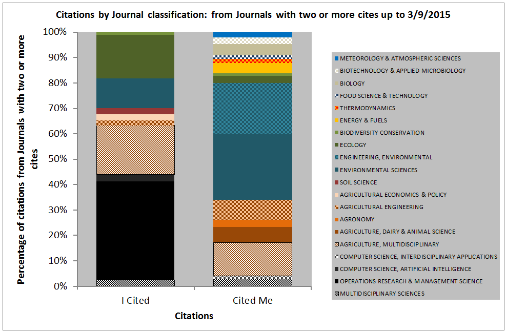
This Post follows on from http://www.OR4NR.interdisciplinary-science.net/2015/09/04/which-journals-are-best-who-do-i-cite-who-cites-me/
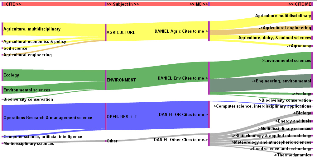
This shows very clearly how I am an applied Operational Researcher. I draw in the science of my three degrees (#Agriculture, Applied Environmental Science) and produce science of use the the engineer, mangers, scientists and policy makers in the agri-environmental sectors. I get nearly no citations from #operational research and #Management Science Journals.
I’ve used Google Developers tools to produce this and they are far better than anything that Excel can do, but it is still a lot of informations to convey. It is hard to control all the features, but it is easier than a bespoke hand drawn visual.
It is an alternative to the column chart, but is it any clearer?